Summary cards
The top section shows four period cards side by side.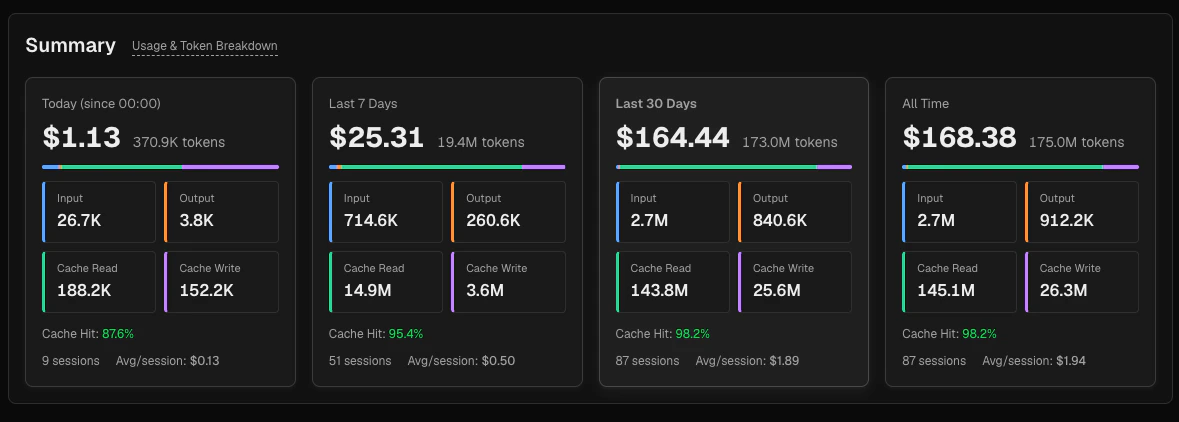
Each card displays:
- Total cost (large) and total token count
- A thin breakdown bar showing the proportional split between input (blue), output (orange), cache read (green), and cache write (purple)
- Four mini-cards for each token type with exact counts
- Cache hit rate — see below for the calculation
- Session count and average cost per session
Token types
Total tokens = input + output + cache_read + cache_write. This is the total token volume for the period — it includes all four token categories.Cost =
(input × P_input) + (output × P_output) + (cache_read × P_read) + (cache_write × P_write) where prices vary by model and provider. Cost figures in Claw Lens are estimates derived from stored message metadata.Cache hit rate
The cache hit rate measures how effectively the prompt cache is reducing your input costs:cache_write is not counted as a cache hit — it is excluded from the denominator. Cache writes represent tokens being stored for future reuse, not tokens being read from the cache.
A high cache hit rate is particularly valuable for agents with long system prompts or large workspace files, because those tokens get served at a fraction of the normal input price.
Token trend chart
The trend chart sits below the summary cards and has its own independent controls.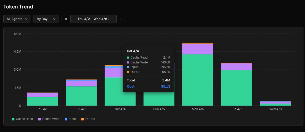
Daily token trend — Token volume by day, stacked by type
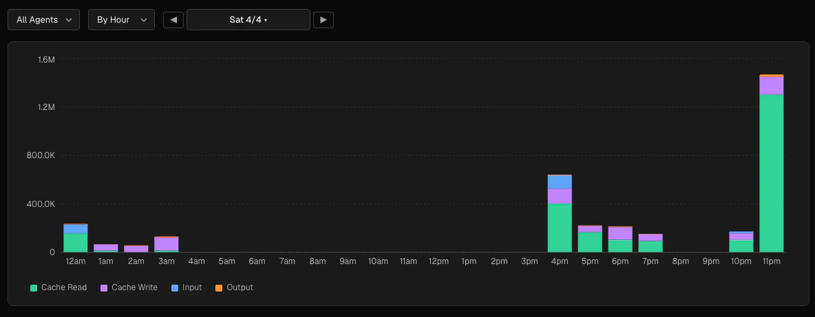
Hourly drill-down — Select a single day to see the token breakdown by hour, in your local timezone
Granularity options
Use the DateNavigator control next to the granularity selector to move backward and forward through time. For the hourly view, navigate day by day. For the daily view, navigate in 7-day increments.
Agent filter
Select a specific agent from the agent dropdown to see that agent’s token usage in isolation, or leave it set to All agents for the combined view.Chart breakdown
The trend chart is a stacked bar chart. Each bar represents one time bucket, and the four segments show the token type breakdown (cache read, cache write, input, output from bottom to top). Hover over any bar to see the exact token counts and cost for that bucket.Breakdown section
Below the trend chart, the Breakdown section shows data for a separately configurable time range. Choose a preset (today, 7d, 30d, 90d, all time) or pick a specific day or 7-day window using the date navigator.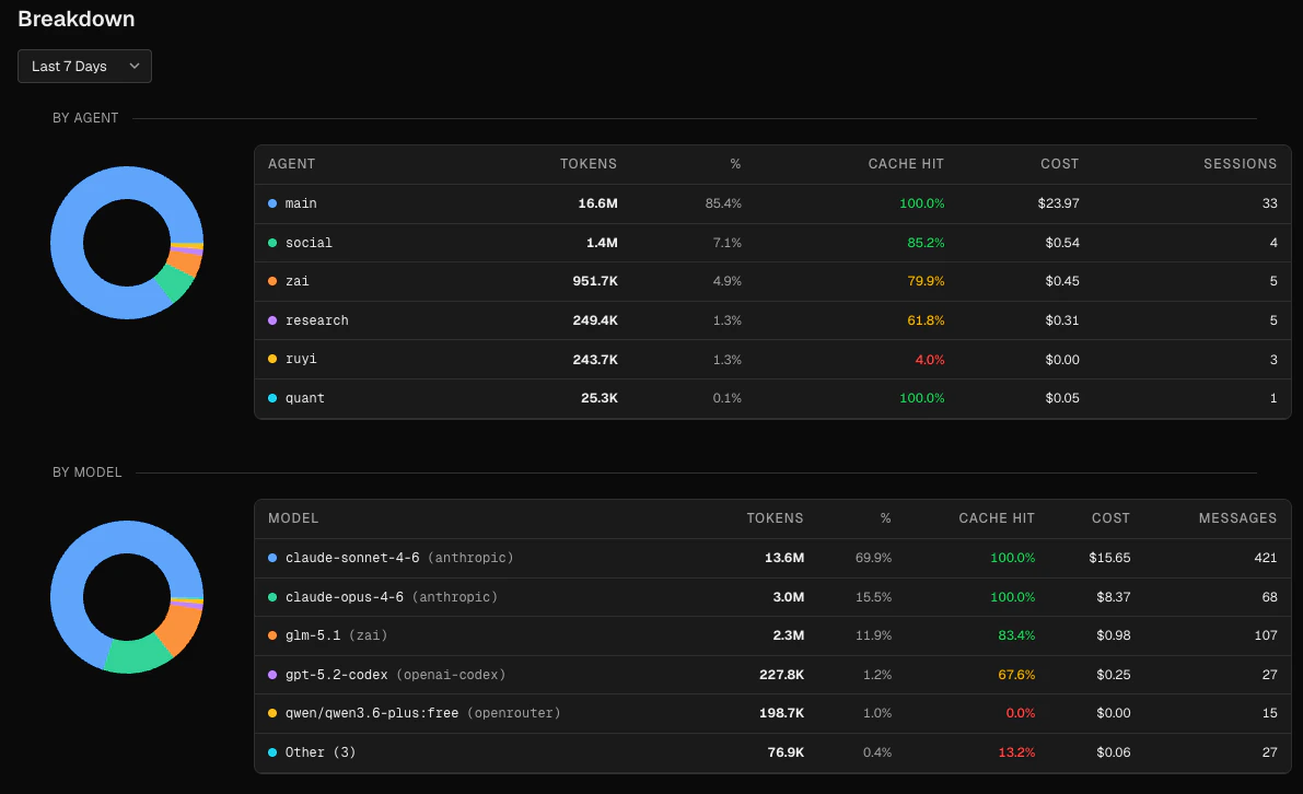
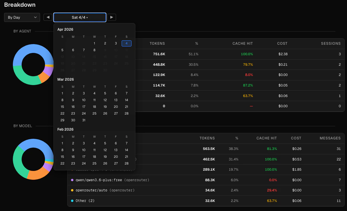
Select a specific day from date picker and see breakdown
By agent
A donut chart and table showing token usage per agent. The table columns are:
Agents with no activity in the selected period still appear in the table with zero values.
Expandable agent rows
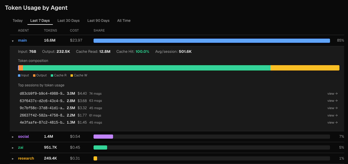
- Input, output, cache read token breakdown
- Cache hit rate
- Average tokens per session
- A token composition bar showing proportional segments
- The top 5 sessions by token count, each linking to the Sessions browser
By model
A donut chart and table showing token usage per model. The table includes the provider name when available (e.g.anthropic). The top 5 models are shown individually; remaining models are grouped as “Other (N)”.
Cron vs manual
A donut chart and two summary cards showing the split between: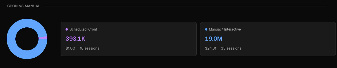
- Scheduled (Cron) — sessions where the first user message contained a
[cron:...]prefix, shown in purple - Manual / Interactive — all other sessions, shown in blue
The cron vs manual classification is determined automatically when Claw Lens reads your session files. A session is classified as cron if its first user message starts with a
[cron:taskId] prefix written by the OpenClaw scheduler. This classification cannot be changed retroactively.Reading the numbers
A brief guide to interpreting the key metrics:Why does my total token count seem high?
Why does my total token count seem high?
Total tokens includes all four types: input, output, cache read, and cache write. If your agents use large system prompts or frequently re-read workspace files, cache read tokens will be a large fraction of the total. This is expected and desirable — those tokens cost much less than uncached input tokens.
Why does cost not scale linearly with token count?
Why does cost not scale linearly with token count?
Different token types have different prices, and different models have different price tiers. Cache read tokens are typically billed at around 10 % of the standard input price. Output tokens are usually more expensive than input tokens. So a session that generates many output tokens can cost more per token than one dominated by cache reads. See the Anthropic pricing page or OpenAI pricing page for current rates by model.
How do I improve my cache hit rate?
How do I improve my cache hit rate?
Cache hits occur when the beginning of a prompt matches what was previously written to the cache. Agents with stable, long system prompts and consistent workspace files tend to have high hit rates. Frequently changing the beginning of prompts or using highly dynamic context will reduce cache efficiency.
What is the difference between 'By Agent' in the breakdown and 'Token Usage by Agent'?
What is the difference between 'By Agent' in the breakdown and 'Token Usage by Agent'?
The By Agent table in the Breakdown section is a summary view that uses the same time window as the other breakdown charts. The Token Usage by Agent section at the bottom has its own independent time filter and provides expandable rows with per-session detail.